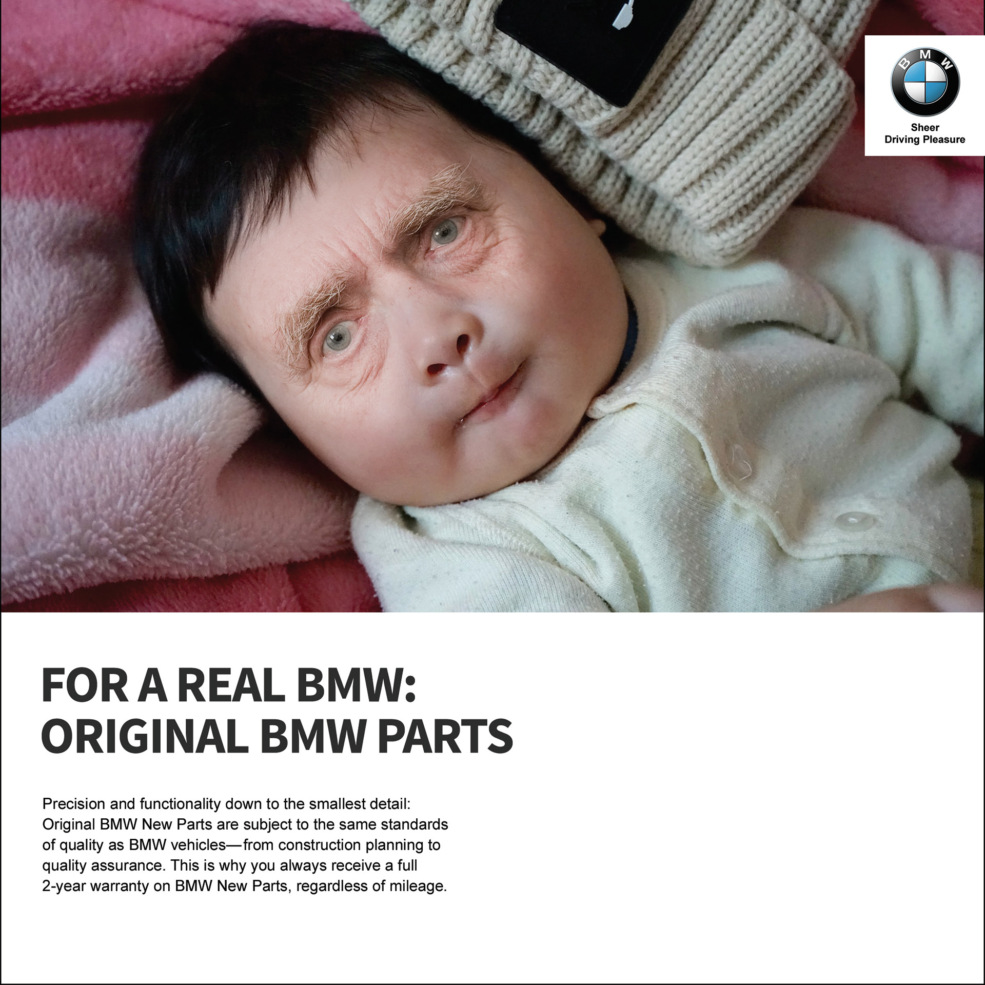
This project was created for existing company of cars-BMW. It was designed to convey the message of not using pirated or second hand parts but only the original parts. The layout is designed with the conventions of BMW ads. Here, I have shown the face of a baby with eyes of an old man as a metaphor for old parts being used instead of original parts. The body copy has been written from one of BMW's original ads.
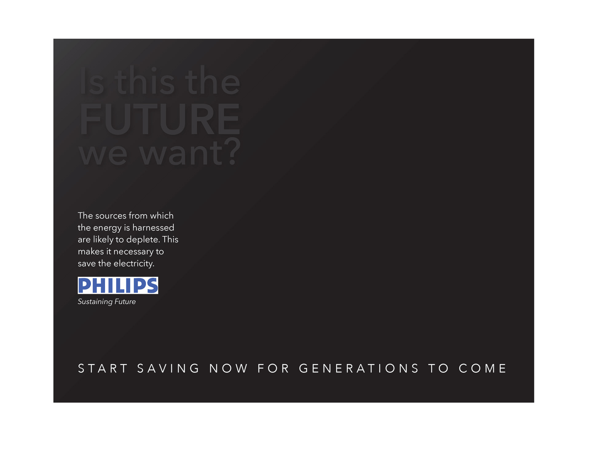
This ad was designed for Philips brand to save electricity. Black has been used which signifies darkness and out of light. The headline will have varnish effect when it will print to make people realize the seriousness of the issue.

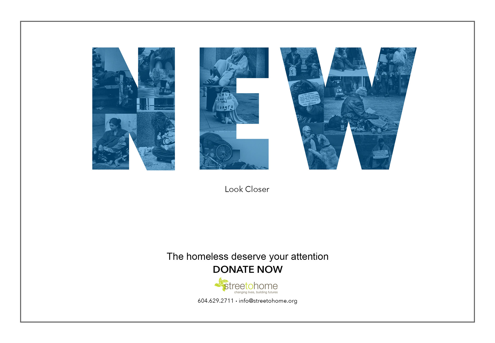
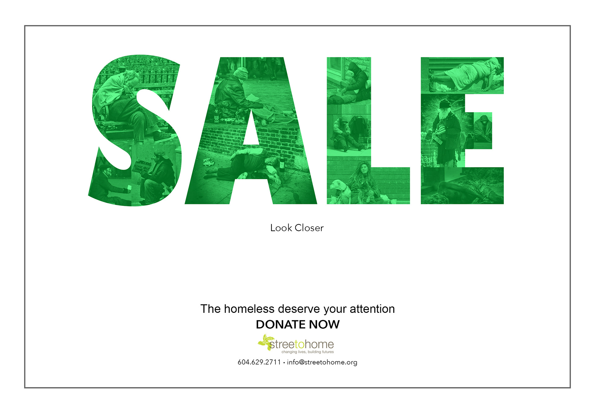
This print ad was designed for a magazine to grab viewer's attention and make them realize that even homeless people needs their attention.To make it engaging, I have used words like Free, New, Sale in cap letters which normally takes viewers attention. At one glance one can only make out the word but when looking closer the images of homeless people can be seen.