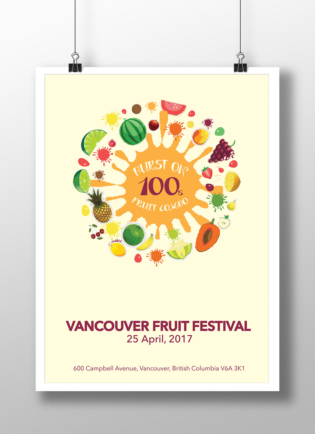
This poster is designed for a fictional event. It highlights the essence of fruits i.e the juice of the fruits. Even with such splashes and fun elements it makes the layout symmetrical and balanced.

This poster was designed to create awareness for people with senior parents. The message was your kids will treat you the same way as you treat your parents. The thin white line connects the elements of the poster and unifies it.

This poster was designed for a sign language workshop for BC Children's Hospital. It is a fun poster as the intended audience were children. The hand illustrations forms an ear and they are gesturing the sign language alphabets.

This poster was designed for my college's 63rd annual exhibition. The numbers are expanded and tweaked to highlight the year of the exhibition.