1. Challenge:
The women audience still percieve Gold’s as a bulky, heavy, hardcore heavy weight, sweaty environment to work in. So
the challenge is to connect with the women and assure them its not a place for just body building but also strength building for women. Another challenge is not changing their identity completely and directed towards women as they would loose its persona of power building for men.
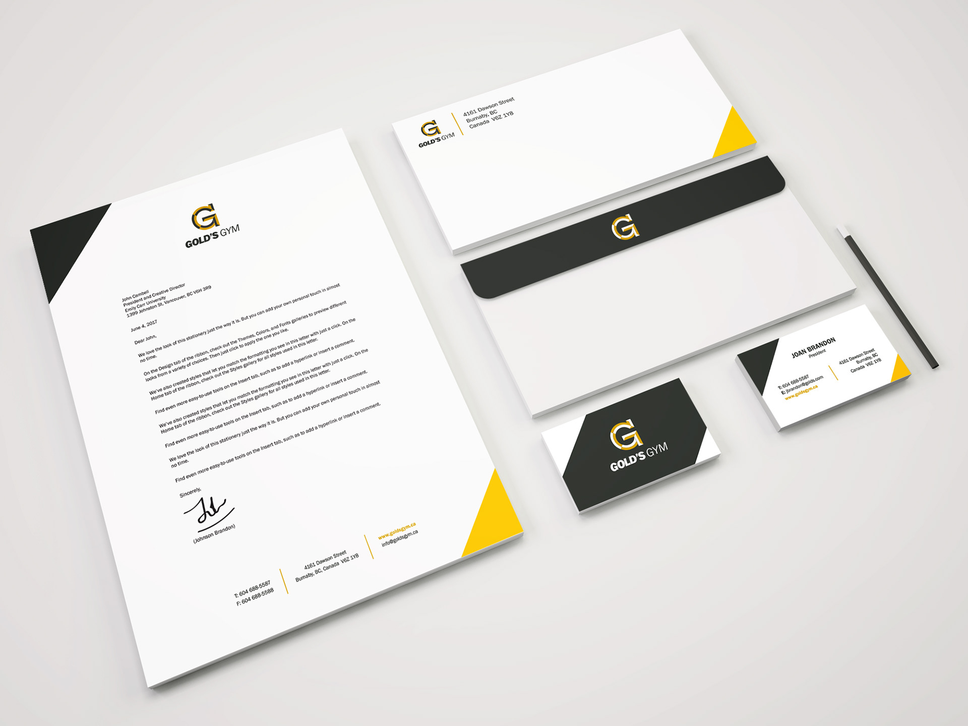
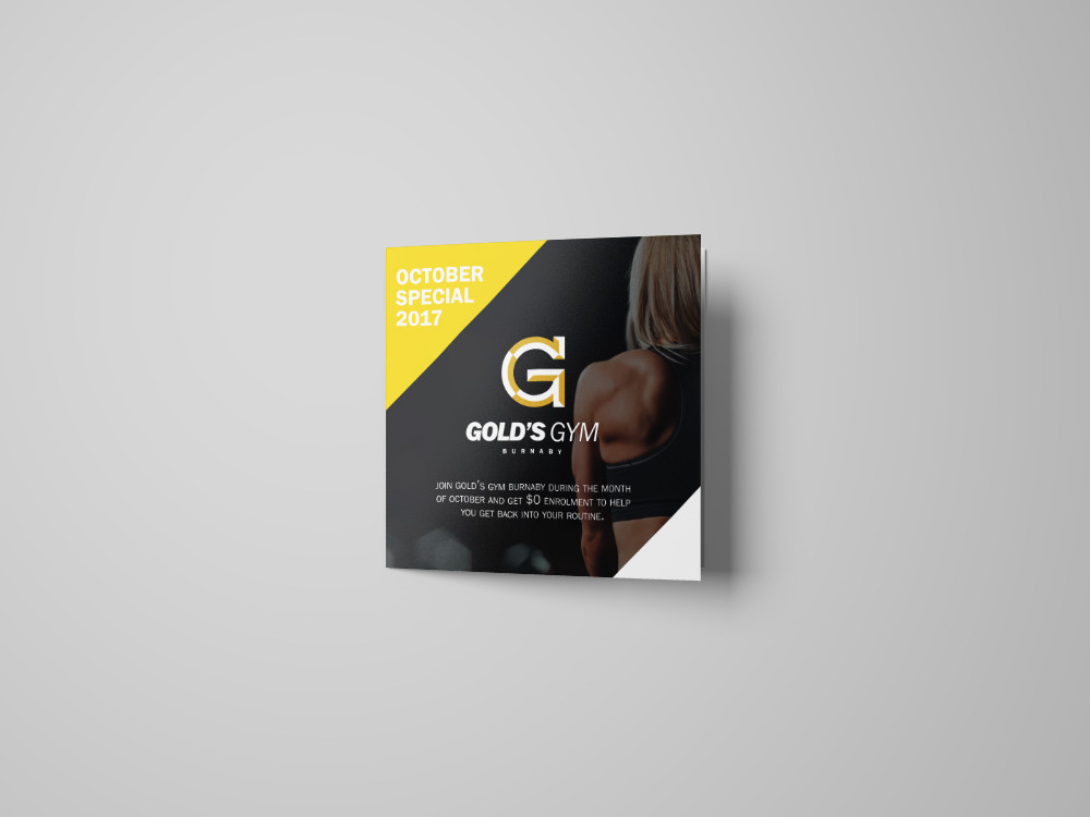
2. Solution:
The identity should be created as such that would appeal to both the men and women audience who are serious about
fitness and power training. There should be a balance between the two audience. The elimination of a man and barbell
from the logo conveys it is not restricted to just men and the weight lifting and the addition of G with more abstract
dynamic and strong bold font makes Gold’s gym appeal to both the genders. Giving a bevelled look, makes the identity
more strong and the colours used are same as before as it conveyed strength.


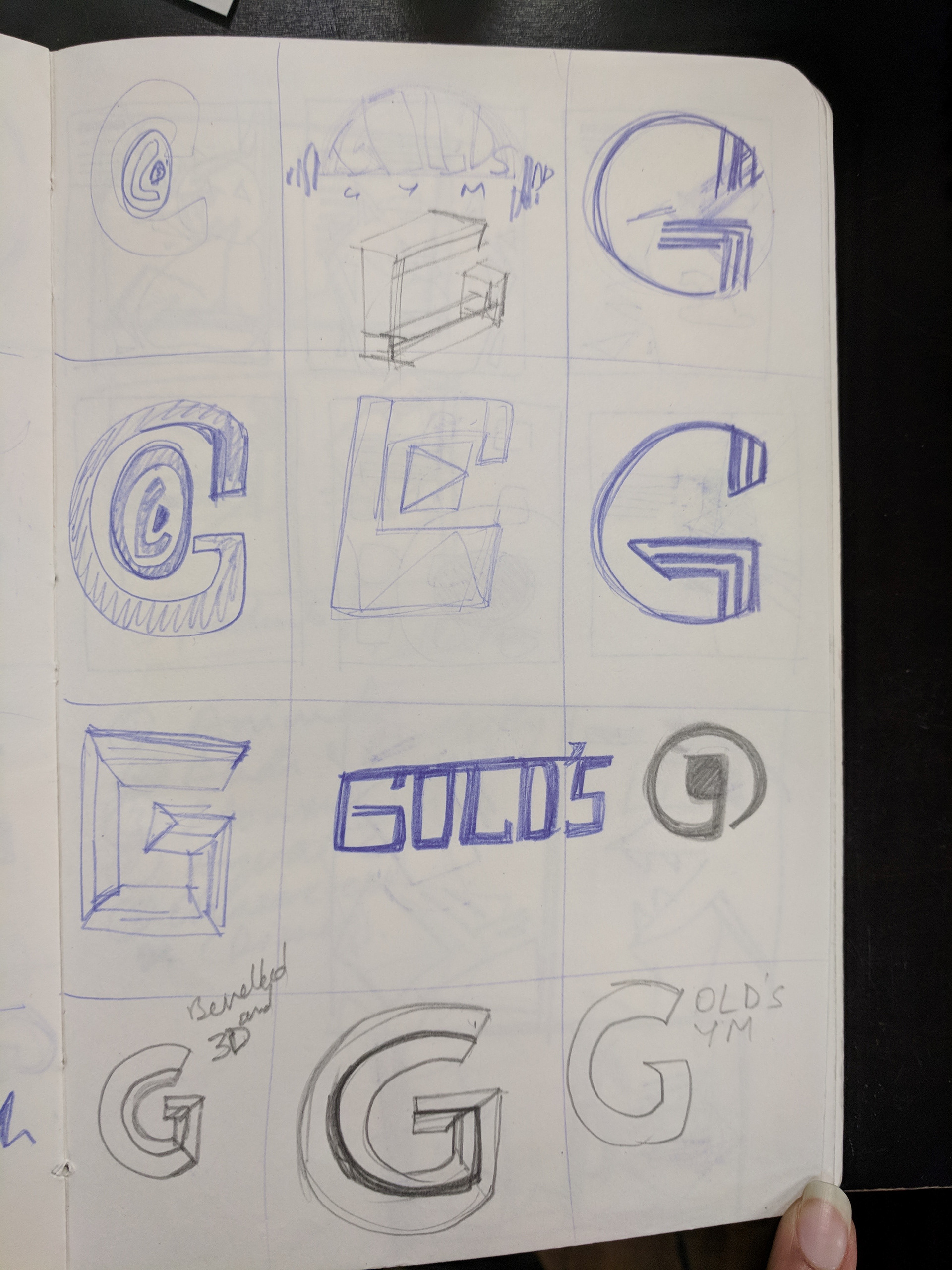
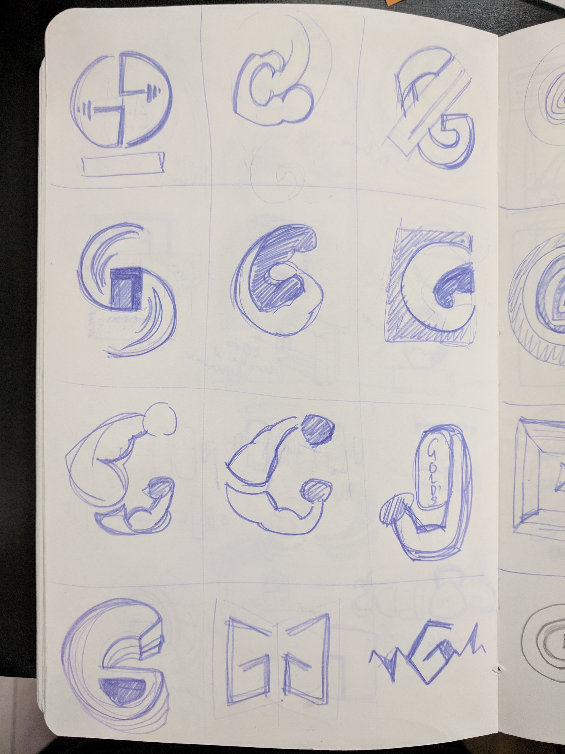
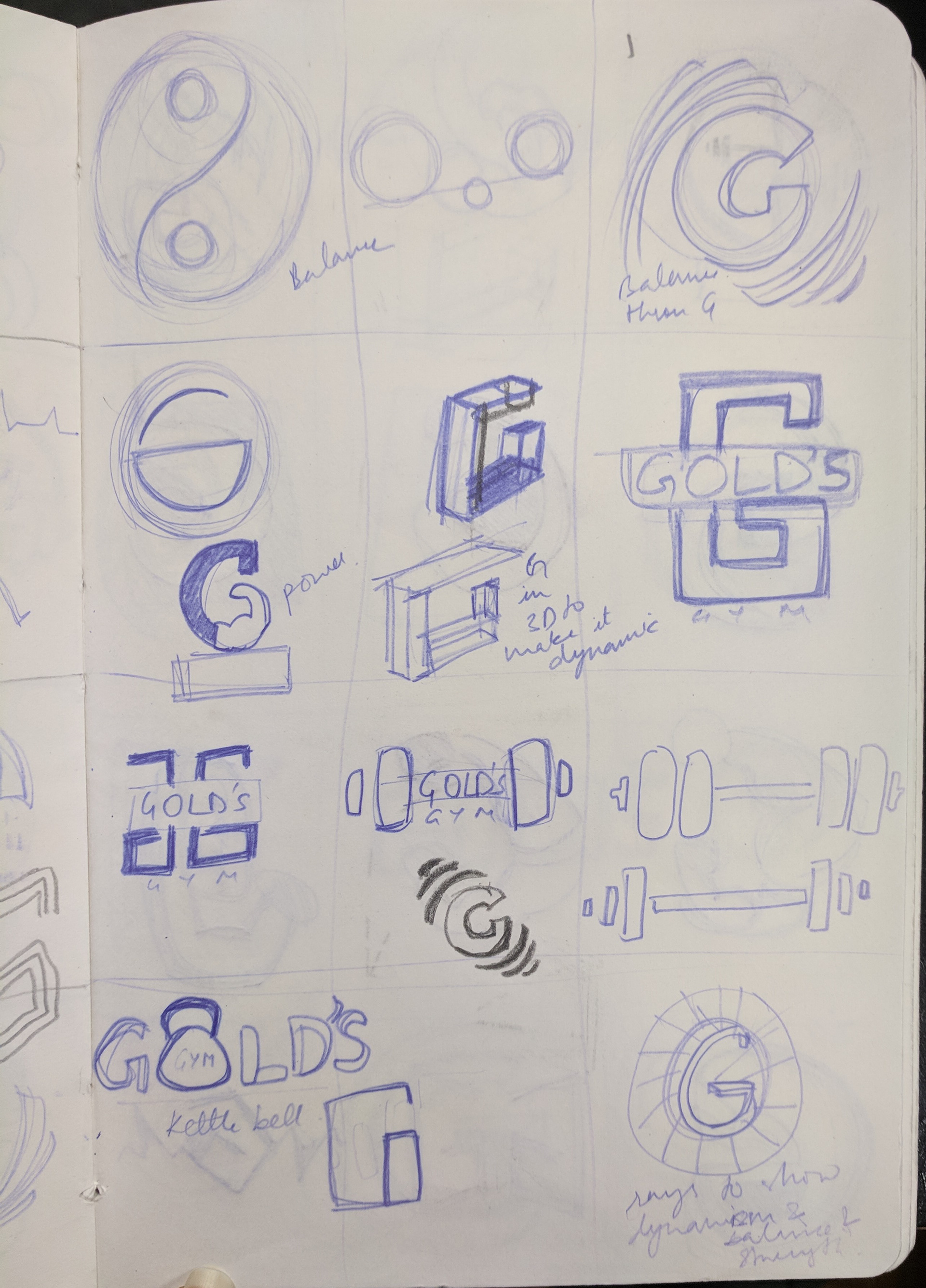
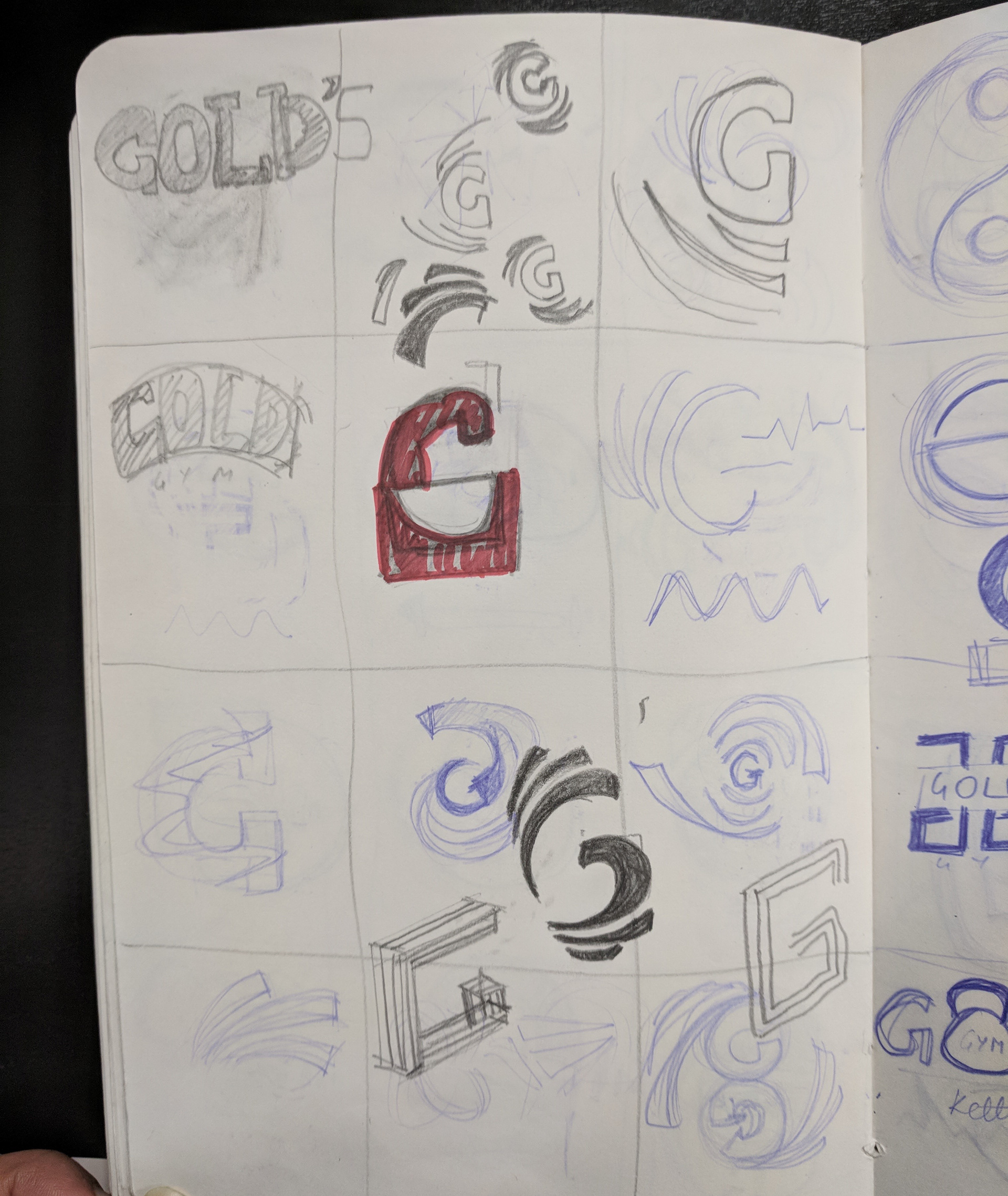
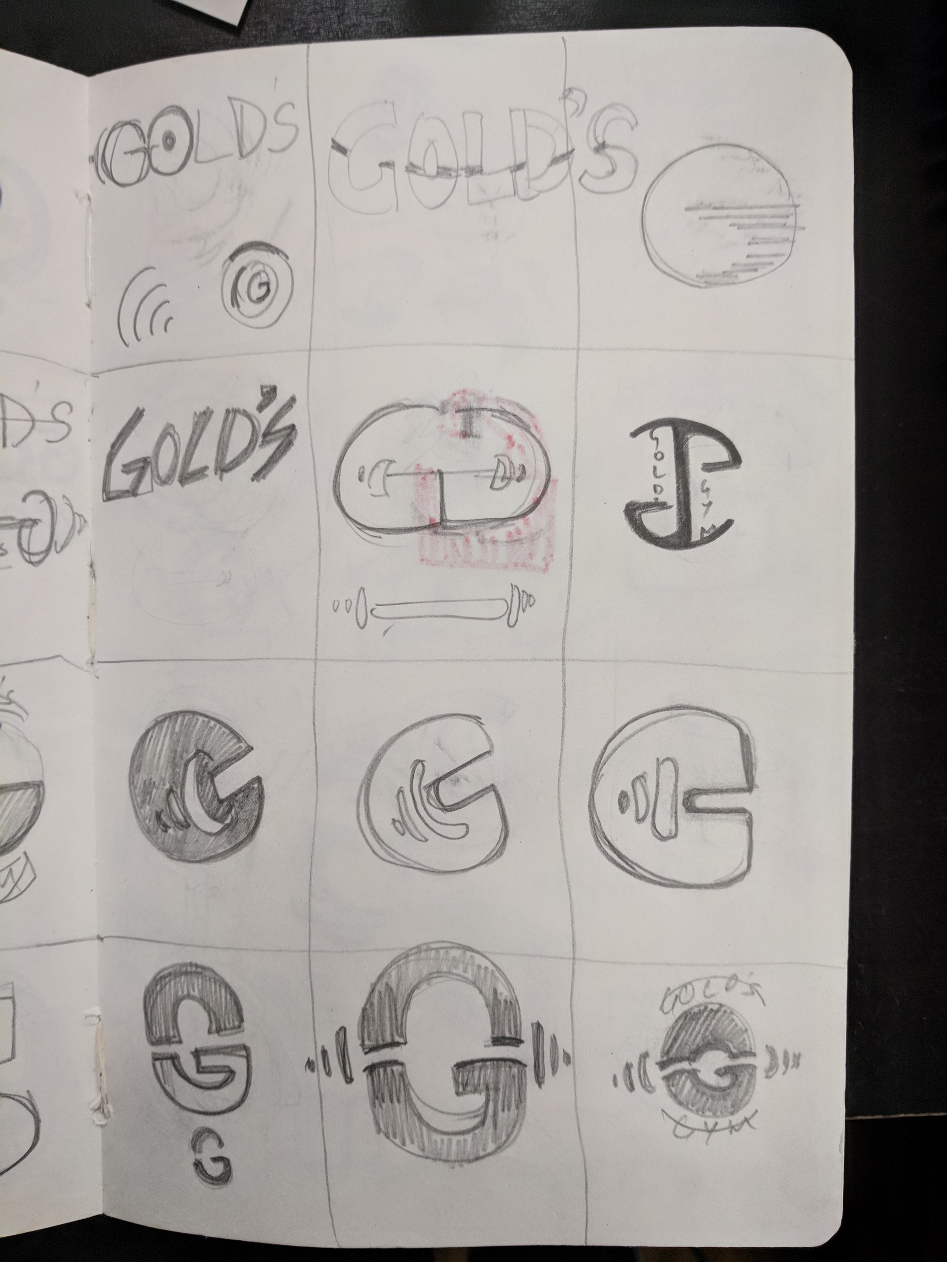


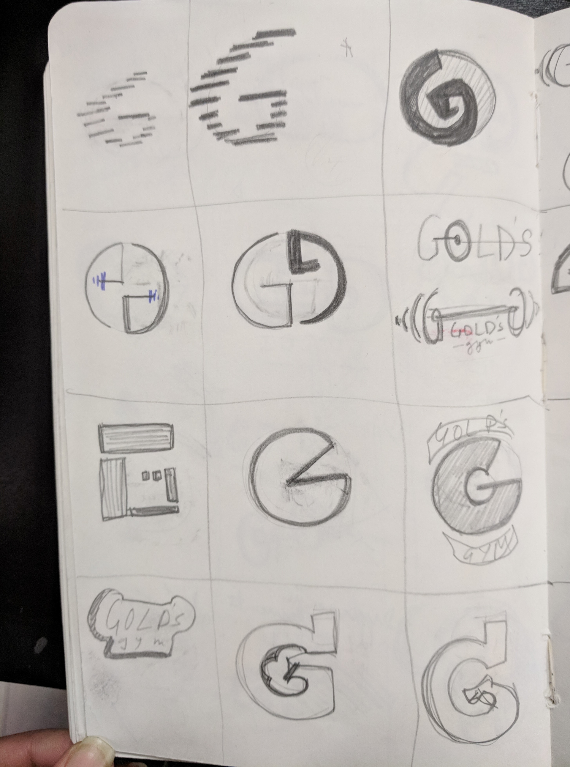
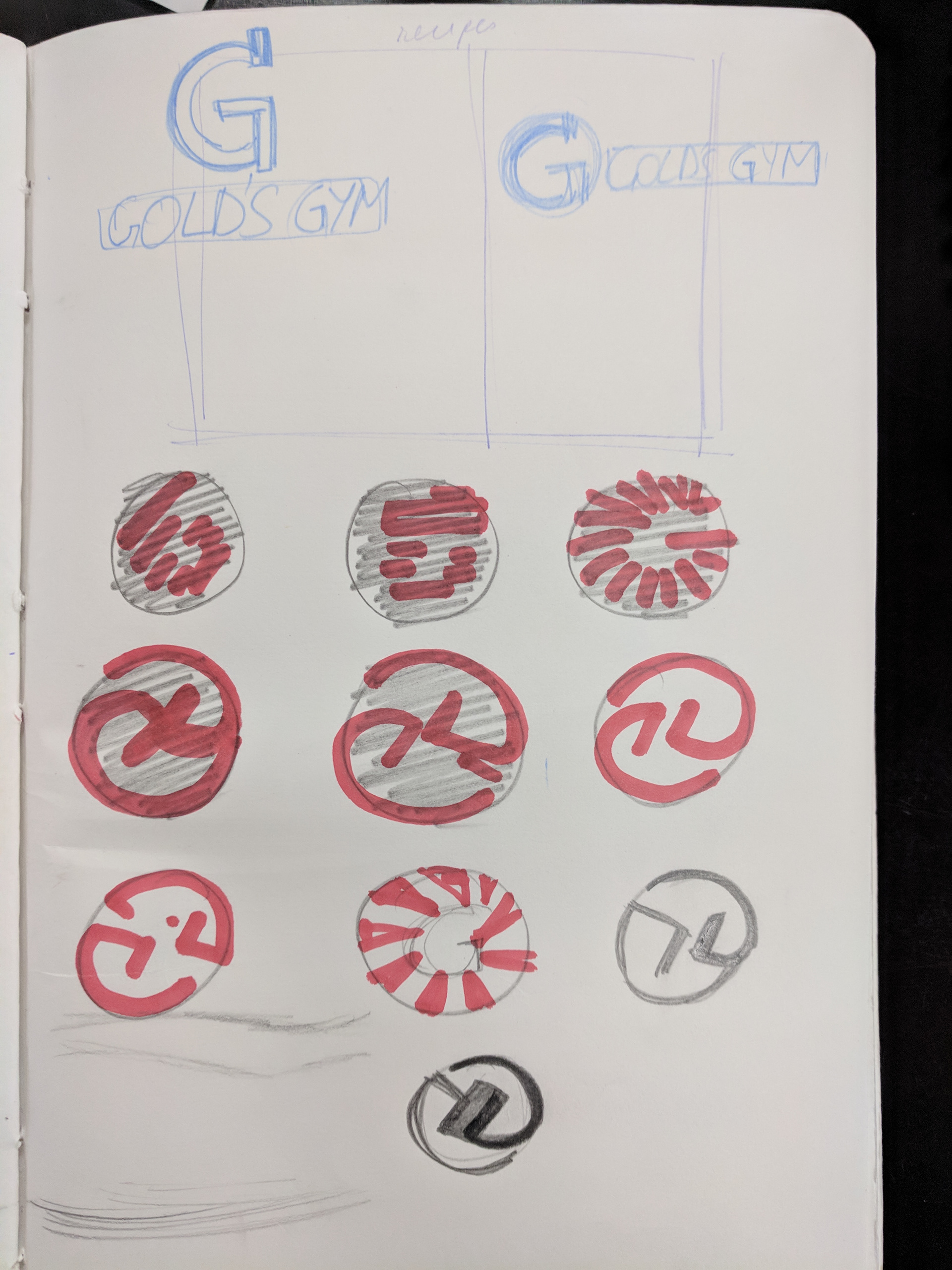
Insight into my sketchbook